[Cross-posted from dclure.org]
Yesterday I made the hop across the country to Boston for the NEH Workshop on Digital Methods for Military History at Northeastern University, where I’ll be giving a couple of workshops about Neatline and soaking up lots of interesting new projects from old friends and new friends alike. Beautiful fall foliage aside, I’m very excited about this! Ever since we worked on the Hotchkiss projects back in 2012, Neatline and military history have been a great pairing. Which is no accident - military history is often about how things change over time on maps, which is basically the tag line for Neatline. In fact, I’ve always assumed that military history played a pretty big role in inventing the whole vocabulary of visual concepts and techniques that have been picked up by digital tools like Neatline - the flowcharts, the arrows, the diagrammatic ways of representing how things move from one place to another. Hotchkiss was using colored pencils to scratch out annotations onto his battle maps back in the 1870s, which is more or less exactly what Neatline is, minus the computer screen.
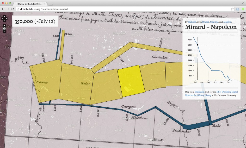
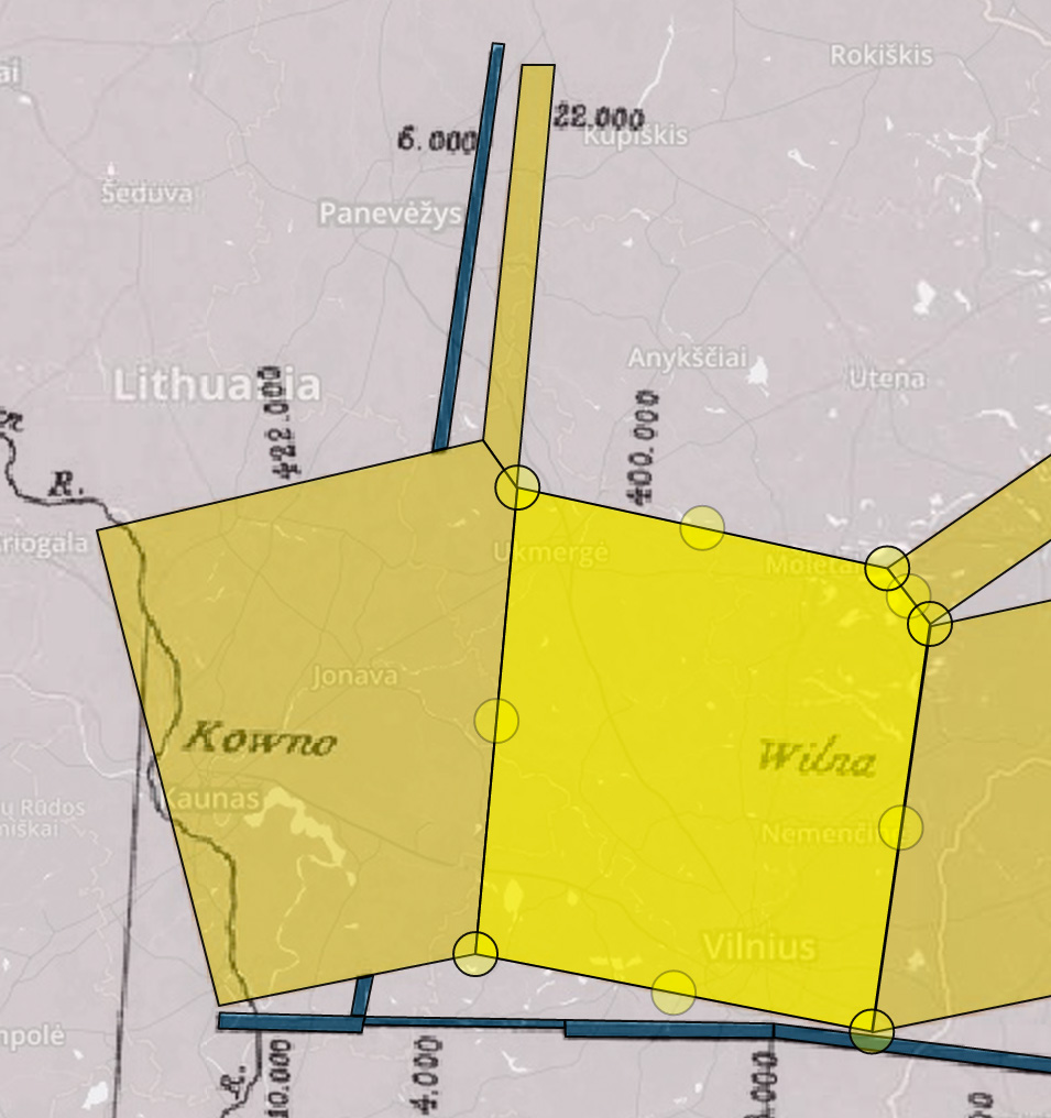
Anyway, when I started putting together the workshop, I decided to use this as an excuse to build out a little Neatline exhibit that I’ve been rolling around in my head about for about three years - an interactive version of Charles Minard’s classic flow diagram of Napoleon’s 1812 invasion of Russia. This is not an original idea. Minard’s map is sort of like the “Stairway to Heaven” of digital mapping and information visualization, and it’s been remade digitally dozens of times. But, I decided to give it try, and see if I could find some kind of interesting riff. I started out by georeferencing a scan of Minard’s diagram, and then traced out vector annotations on top of each of the individual segments that represent the deteriorating size of the Grande Armée over the course of the invasion:
Once the basic structure in place, I realized that I didn’t really have an intuitive sense of the scale of the whole thing - how far was it from the Neman River to Moscow? How long did it take? It turns out that the march was about 540 miles in each direction. I fired up Illustrator, blocked in a little ruler-like shape, and dragged out the annotation along the top of the map:
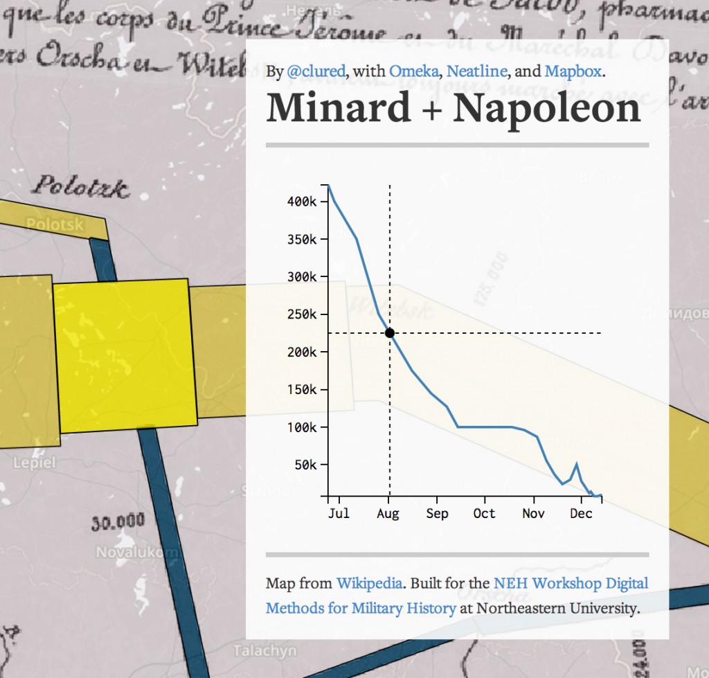
Then, the question of time. This seemed like a good excuse for some d3. I made a little chart on the right side of the screen that plots out the size of the French army over the course of the ~5-month interval of time between when Napoleon crossed the Neman on June 24 and when that last little bit of the army stumbled back out of Russia in December 14. Then, in the exhibit theme, I wrote a little bit of Javascript that wires up the graph with the vector annotations on the map - hover on the graph to highlight the corresponding blocks in Minard’s diagram, and click to zoom to that location:
Anyway - simple but fun. I’m looking forward to spending the next two days learning from people who actually know something about military history!


